
Overview
Reel You is social media with a social conscience. They're on a mission to help people find the joy in their journey. People can document moments that matter without taking away from the actual experiences. It caters to people who love reminiscing over the past, planning their future, and seeing their life in new ways without apps manipulating their attention at the expense of their wellbeing.
Design Challenge
How might we redesign “You” (profile page) in Reel You’s app to reflect on the user’s journey throughout the app while remaining true to Reel You’s brand story and vision?
ROLE
UX Research
UI Design
Prototyping
Animation
TEAM
1 FE Engineer
1 BE Engineer
PM
TIMELINE
Jul-Aug 2021 8 weeks

Project Constraints
Embody open-ended words like positive, optimistic, knowledgable.
There was a shift in responsibilities for the project midway and I was asked to perform roles across multiple disciplines.
New designs impacted existing systems.
Empathy Interviews
I reached out to 2 loyal Reel users to conduct empathy interviews so I can better understand their needs and discover areas of opportunity. Here are some questions I asked:
Describe the transition from popular social media apps to Reel You? What’s working? What isn’t?
Is there a disconnect after you post a moment? Why?
3. Describe why “You” is your least visited page.
Insights
Sarah
“I feel like I put a lot of effort curating my moments but don’t recieve much in return. There’s not a lot of things to help me stay on the app.”
“Moments created with friends and family deserve some other kind of spotlight because they’re such meaningful relationships.”
Emily
“I miss the sense of instant gratification after posting to social media.”

1st Iteration
Badges
Establish user status and reward people with badges to ensure instant gratification.
Discovery
Use past data to suggest new locations to visit around you.
Goals
A feature to routinely check back on while instilling better habits.
Project Goals
Encouraged behaviors:
Moment creation
Moment sharing
Focus areas:
Youser’s journey and how it intersects with other people, places, activities
Show how you compare to others (more in the sense of “you are not alone” instead of “me vs. you”)
Moment “Youtilities”
My past design that included discovery and goals reminded me of widgets and that’s the initial spark that set the foundation for the rest of the design. Everyone entering their “You” deserves their own unique experience. That’s why people are greeted according to what time of day it is and are provided a meaningful quote. The Moments widget helps to encourage moment creation and sharing.

People “Youtilities”
Allows people to view your closest friends and family’s relationship and journey on Reel You through the people’s widget. Insights shared between two people highlight past recent and future moments, shared locations and tags.

Success Metrics
Largest increase of shared moments in for a given week in the past 6 months
41% increase of active users
Over 100+ new installs
Learnings + Findings
This was a challenging project for everyone so it was important to hold weekly meetings with engineers, communicate with them through Github/Figma and check in through Slack. Introduced a grid system for designs for clean layouts and hope to introduce the grid system throughout the app. This project has changed the realm of Reel You and as a result created a domino effect of future projects to work on. Adaptable feature. You can easily remove widgets or add new ones.

Design Challenge
How might we redesign the onboarding experience in Reel You’s app to reflect a simple yet effective user experience while implementing the new brand identity?
ROLE
UX Research
UI Design
TEAM
1 FE Engineer
1 BE Engineer
PM
Project Constraints
Utilize systems from old onboarding system to new one to reduce the time it takes to build for engineers.
Adjust all UI Design to new design system and incorporate grid system.
Usability Testing
5 participants between the ages of 20 to 26 who have never used Reel You before were asked to sign up and go through the onboarding flow. Here are some questions I asked with my partner:
1. What are common areas of confusion for users during app setup?
2. What features do users like and dislike?
3. What is the usability score of Reel You?
Usability Testing Insights
5 out of 5 users preferred “manual” sign up instead of Apple
3 out of 5 users were hesitant about sharing phone number
3 out of 5 users were confused on how steps were organized for onboarding (ex. password before email)
Average SUS Calculation: 71 | Net Promoter Score: -40
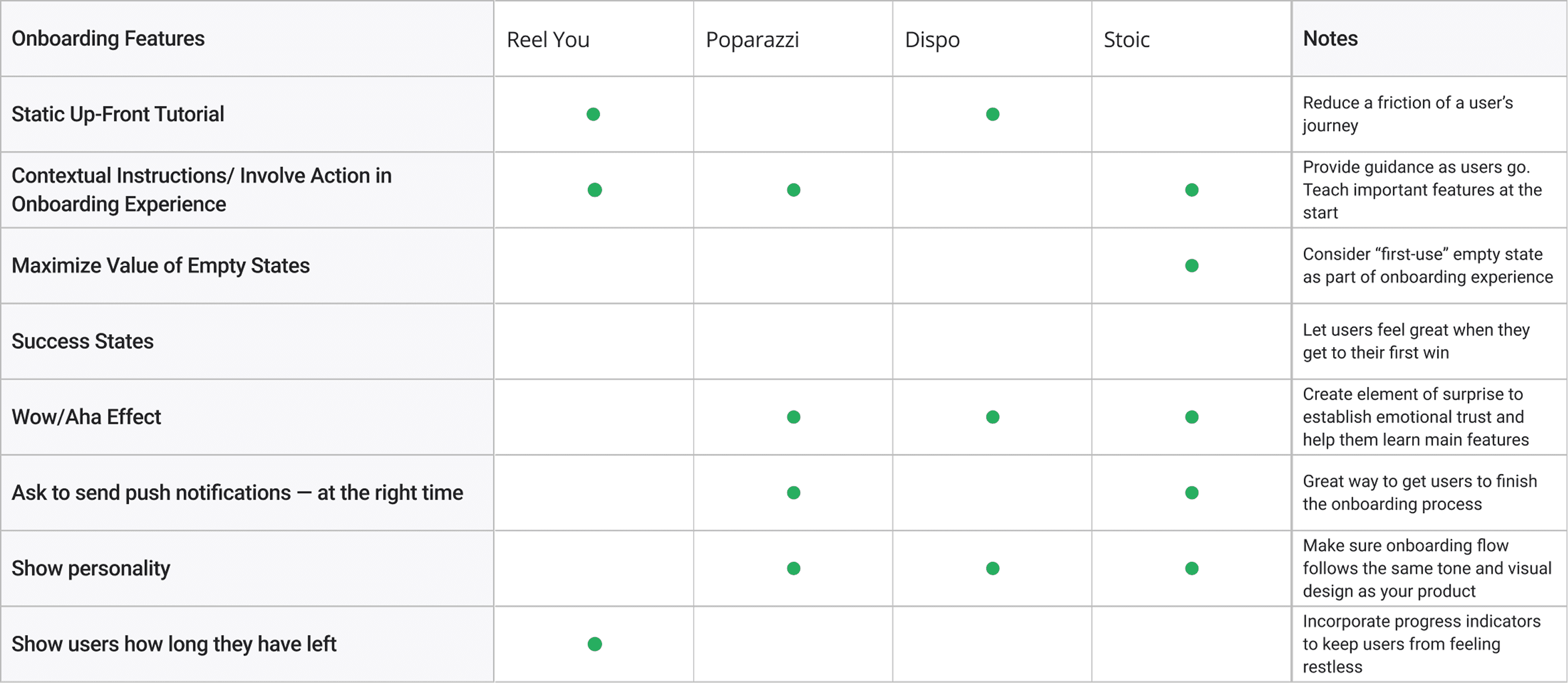
Competitive Analysis
Highlighted competitor onboarding workflows to see areas where Reel You needs more attention for redesigns.

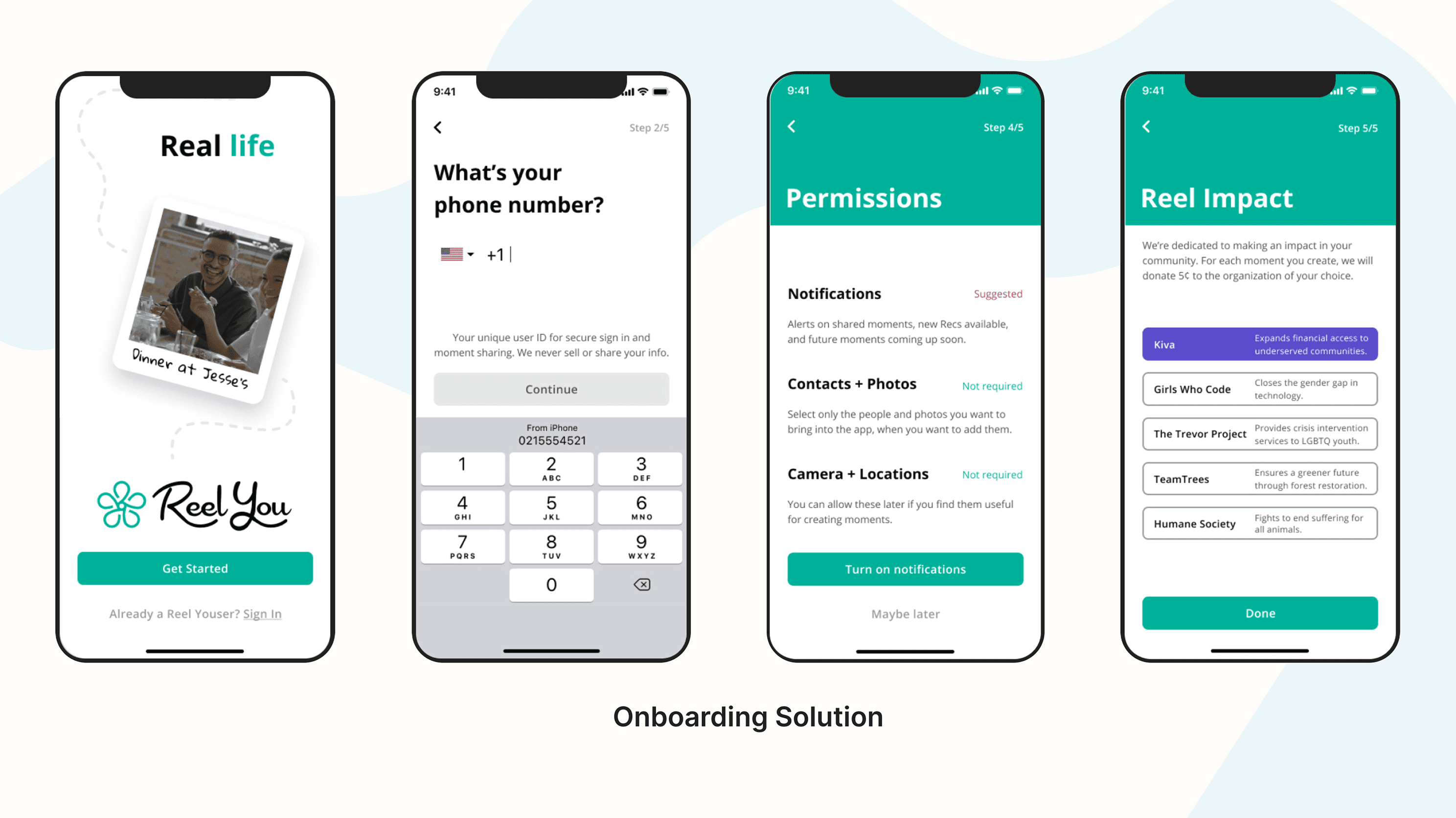
Onboarding Solution
Goals
1. Transition onboarding experience to reflect brand identity
Solution
2.Onboarding refresh reflects new UI design system and brand identity.
Usability Study Insight
3. 5 out of 5 users preferred “manual” sign up instead of Apple
Solution
Promote faster and safer sign up process by highlighting Apple and Google sign up.
Usability Study Insight
3 out of 5 users were hesitant about sharing phone number
Solution
Let onboarding users know why we need specific information.
Learnings + Findings
This project seemed to put on a lot of pressure at first because I had full control of people’s first impression of the app. There were a lot of criteria I had to make sure to incorporate while keeping everyone’s best interest in mind. (Engineering, Product Manager, Users)
This product is currently in the works but I’m excited to test solution with the same 5 participants and see if usability scores benefit from it. I’ll be looking for other areas of opportunity to emphasize onboarding (empty states, instructional tutorials).


Page is over, but are we?
Let’s chat!
347.982.9000
© 2025 MARYAM KHAN